The Farmhouse Guest Bedroom and Bath: Before + After
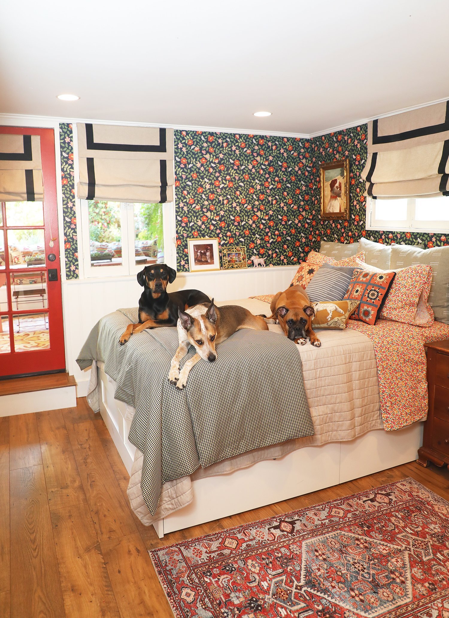
After.
Just a quick orientation before we dive into the full tour: our house has a bit of a…let’s call it quirky… layout. It sits on a slightly sloped lot, and so when you see it from the street (take a look at the front of the house here), it looks like a cute, single story structure. In actuality, it’s a cute two story structure; you enter into the main, street level (which consists of the living room, kitchen, powder room, and primary bedroom suite), and then you go down a set of stairs to two more bedrooms, a bathroom, and a laundry room area. Both downstairs bedrooms open onto a lovely little patio and then out into the garden. I looooooooooved that these rooms opened onto the garden, and even though there was nothing inspiring to look at out there when we bought it (more on our yard transformation soon), I knew that one day these rooms would have a lovely garden view (which is why we have always jokingly told guests they were booking The Garden Suite when they came to stay.)
The original 1908 home was likely just the upper floor and consisted of a kitchen, living room, two bedrooms, and a bathroom. At some point in the 60’s or 70’s, someone came through and finished out the lower level adding two bedrooms, and a bath. There was also a “laundry room” that consisted of somebody sticking a washer and dryer in what was basically a dirt crawl space.
The lower level addition was…interestingly done. It was a very odd mix of materials sort of hodgepodged together. Kind of looked like they just used what they could get their hands on to cobble into a livable space. Which I can respect—you gotta do what you gotta do, right? Respect…but we’ll just go ahead and change everything. Respectfully.
So let’s get to that before pic, shall we?
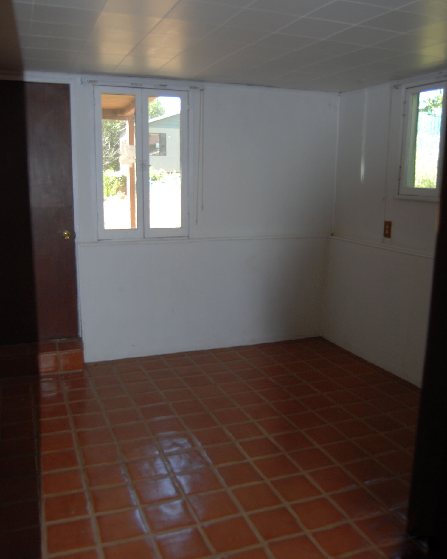
Before. Eek.
There’s a lot to unpack here. But let’s go ahead and contrast it with an after pic.
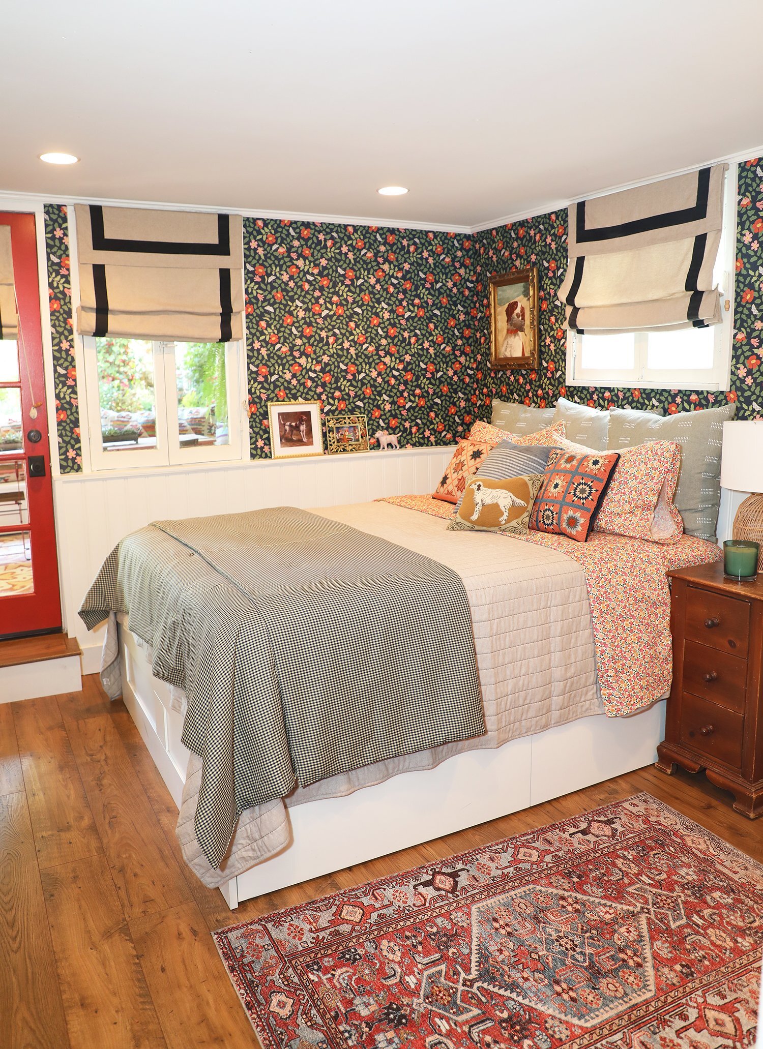
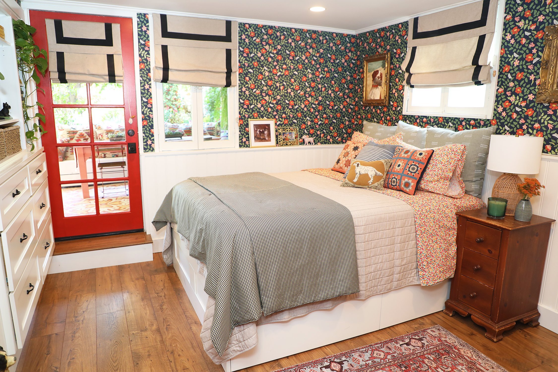
After.
This bedroom definitely started out pretty depressing. It felt more or less like an office building basement. Some fun features: an acoustical tile ceiling, terracotta tile floors, and a single, lonely wall sconce next to the door as the one and only light source. But the BEST feature (and I’m not sure why I didn’t get a photo of it) was what looked like a small and very out of place California-style mirrored sliding closet right next to the exterior door. More on that in a bit.
The VERY first thing we did was swap out the solid exterior door for a french door, and that simple little upgrade made SO MUCH difference to the feeling of the room.
After.
After.
Back to that odd California Closet (it was located where the built-ins are in the above photo)—it had your typical sliding mirrored doors, but when you slid them open; SURPRISE! the entire closet was only about 10 inches deep and instead of a closet rod running the length of the closet like normal, it had multiple short rods hung perpendicular to the closet doors because it wasn’t deep enough to hang clothes normally. Instead you had to hang them so the clothes faced you (it was almost like hanging half a dozen shirts piled onto a wall hook), which meant you could see the front item of clothing, and then none of the rest of the items behind it. It was really neat.
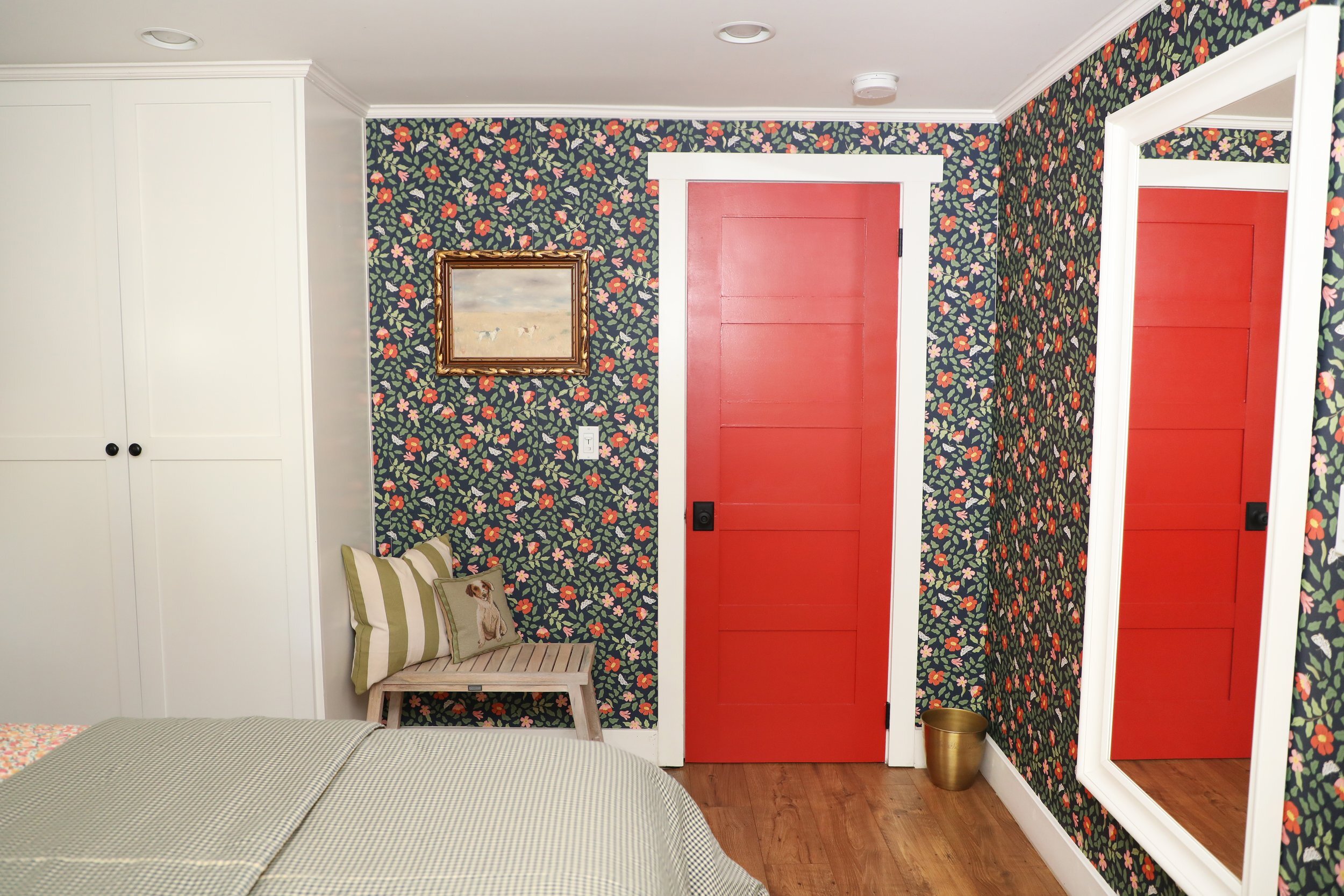
We knew immediately two things: we’d need to add a real closet to the room elsewhere, but also that the existing strange, shallow closet could turn into a pretty functional built in shelving and drawer system. So we did that, and then we added a more normal built-in wardrobe in the opposite corner of the room. You know….the kind that is deep enough to hang your clothes properly in.
After.
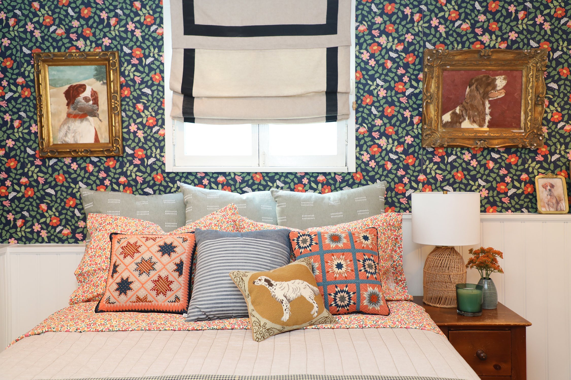
After. Shout out to my grandfather’s paintings of his faithful dogs over the years. This one is named Murphey (fun fact: he named all of his Springer Spaniels Murphey—probably had five or six over the years).
We obviously removed the acoustic tiles from the ceiling and were then able to raise said ceiling by a couple of inches when we drywalled. Also—we installed recessed lighting which was a vast improvement over the solitary wall sconce.
After.
As throughout the rest of the house, the new floors are the Pergo Portfolio with WetProtect laminate wood (see bottom of this post for link to sources) and we are obsessed. I will never NOT have these floors in my house. They are phenomenally durable, and look and feel SO realistically like farmhouse plank wood floors. I’M A FAN.
After.
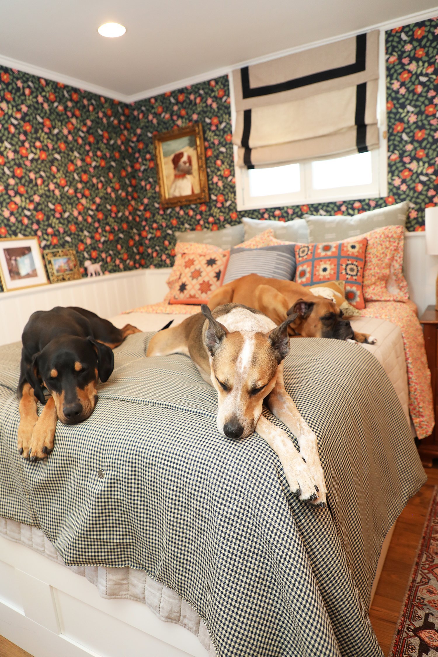
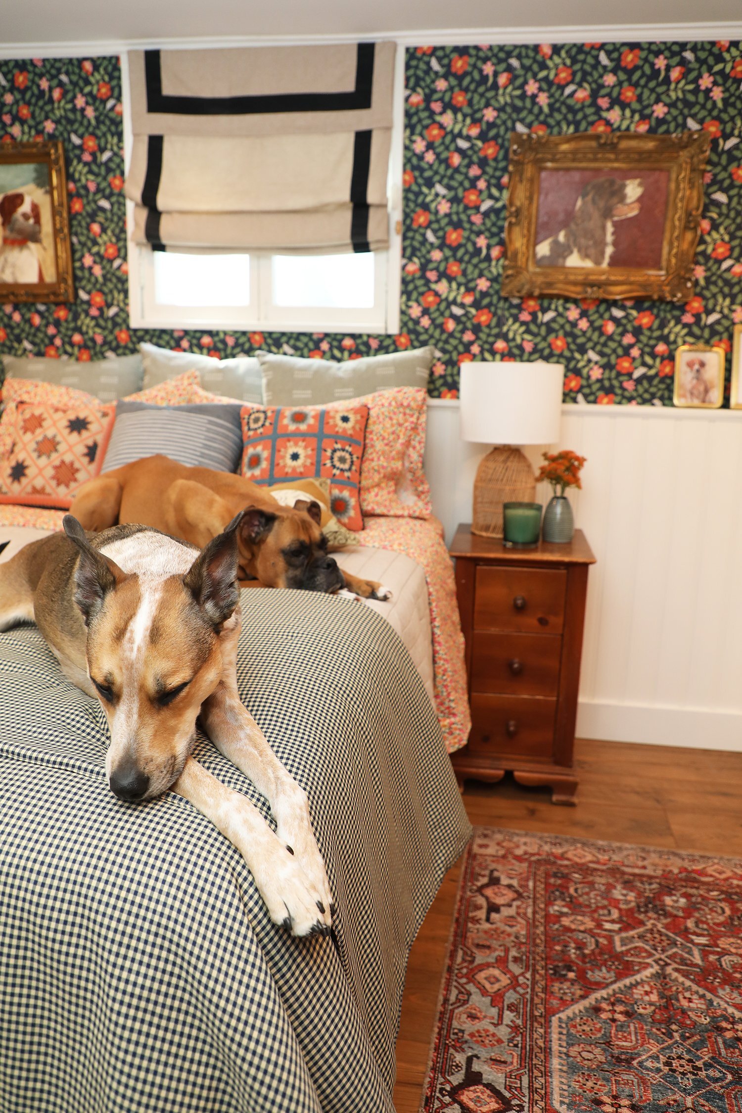
While the rest of the house is decidedly chicken-themed in its decor choices, this is the dog room. Mostly, it’s the dog room because the dogs seem to believe it is their room, and also because there’s lots of dog decor and artwork. But mostly because the dogs have staked their claim.
After.
After.
And now we shall ungracefully move on to the guest bathroom which is located just off the hallway next to the guest bedroom….
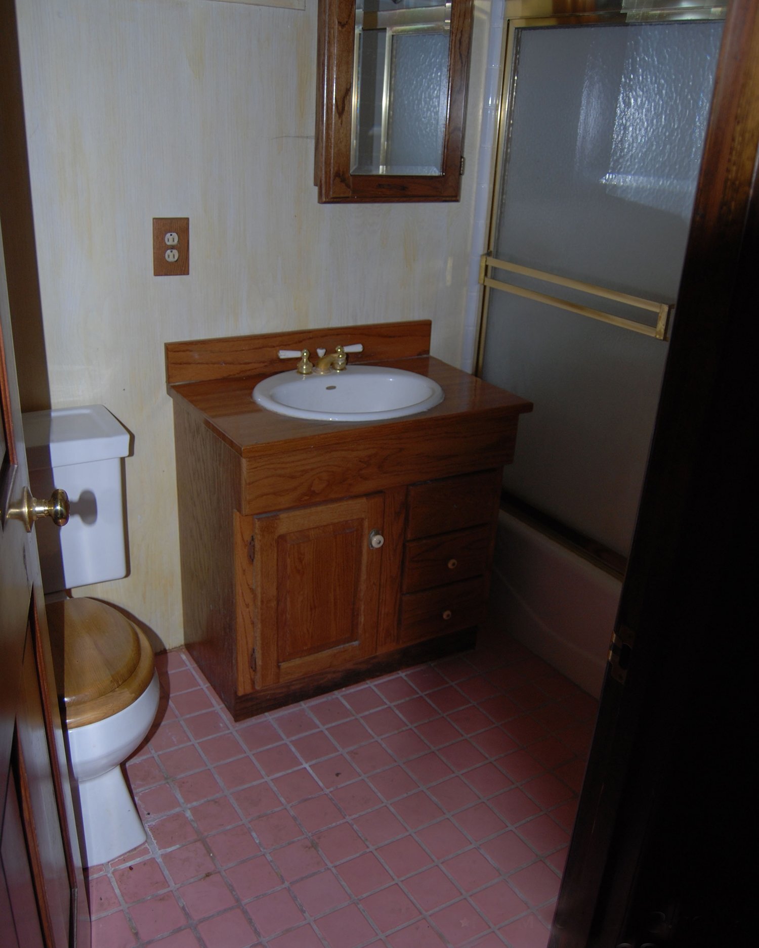
Here’s what that lovely little room looked like before:
Before.
Gorgeous, right??? Gotta love those wood toilet seats.
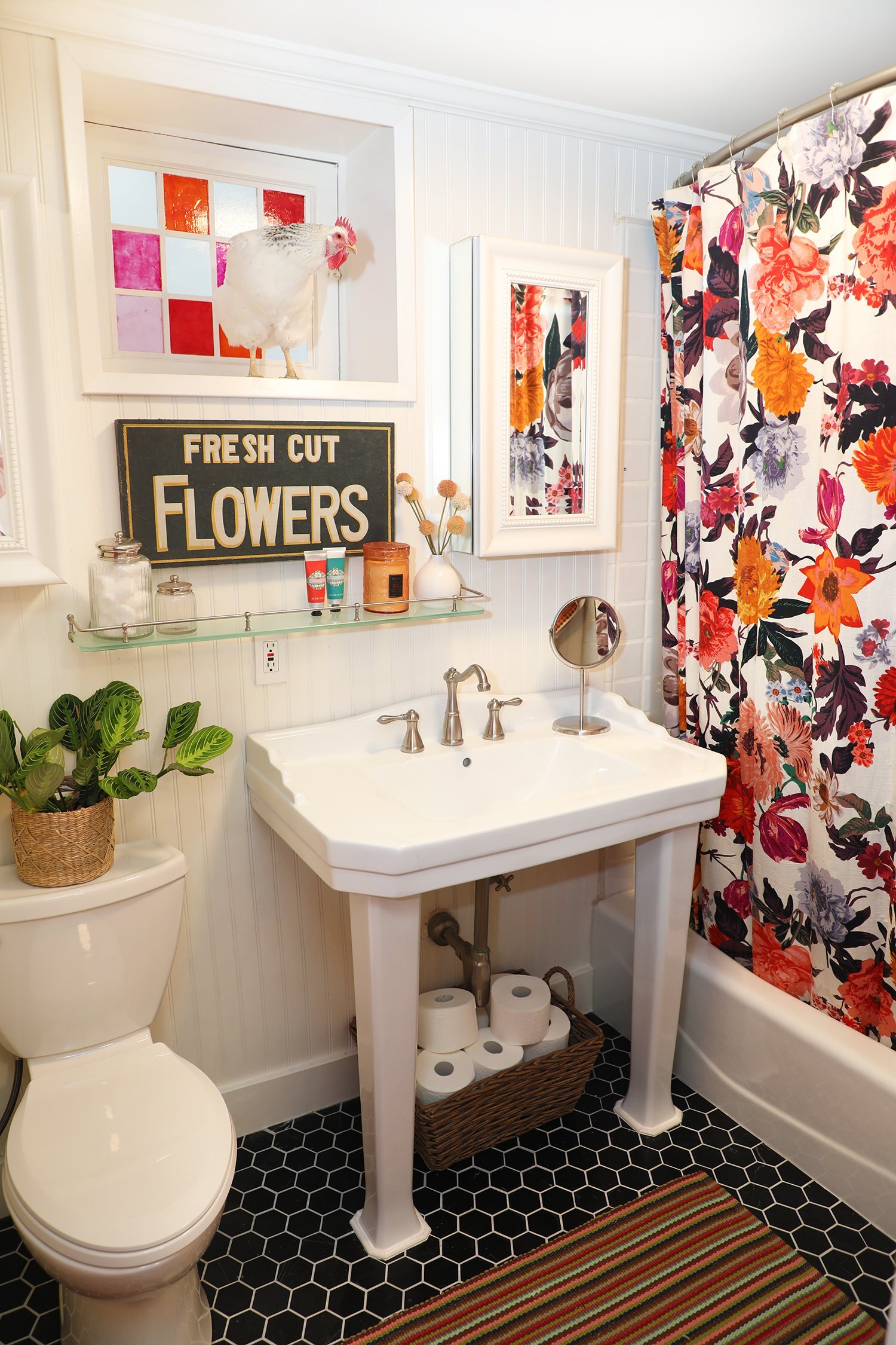
After. Sadly, no more wood toilet seat.
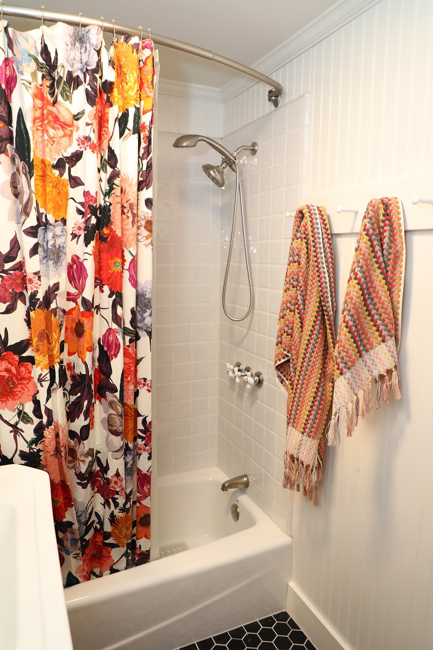
After.
Despite the fact that whoever created this bathroom went with pink tiles on the floor, the tub and shower tiles were white, so we were able to leave the tub and shower alone and just replace everything else (although, truth be told, if the shower tile and tub had also been pink, I would have probably left it allllllll and leaned into the pink life).
And yes, we replaced the tile floor with hex tile because it looks like chicken wire. Yes, indeed, we did.
After.
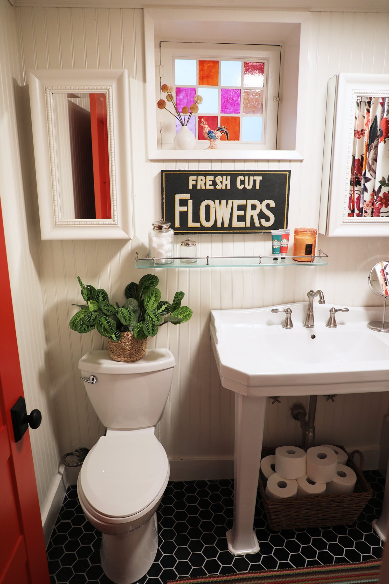
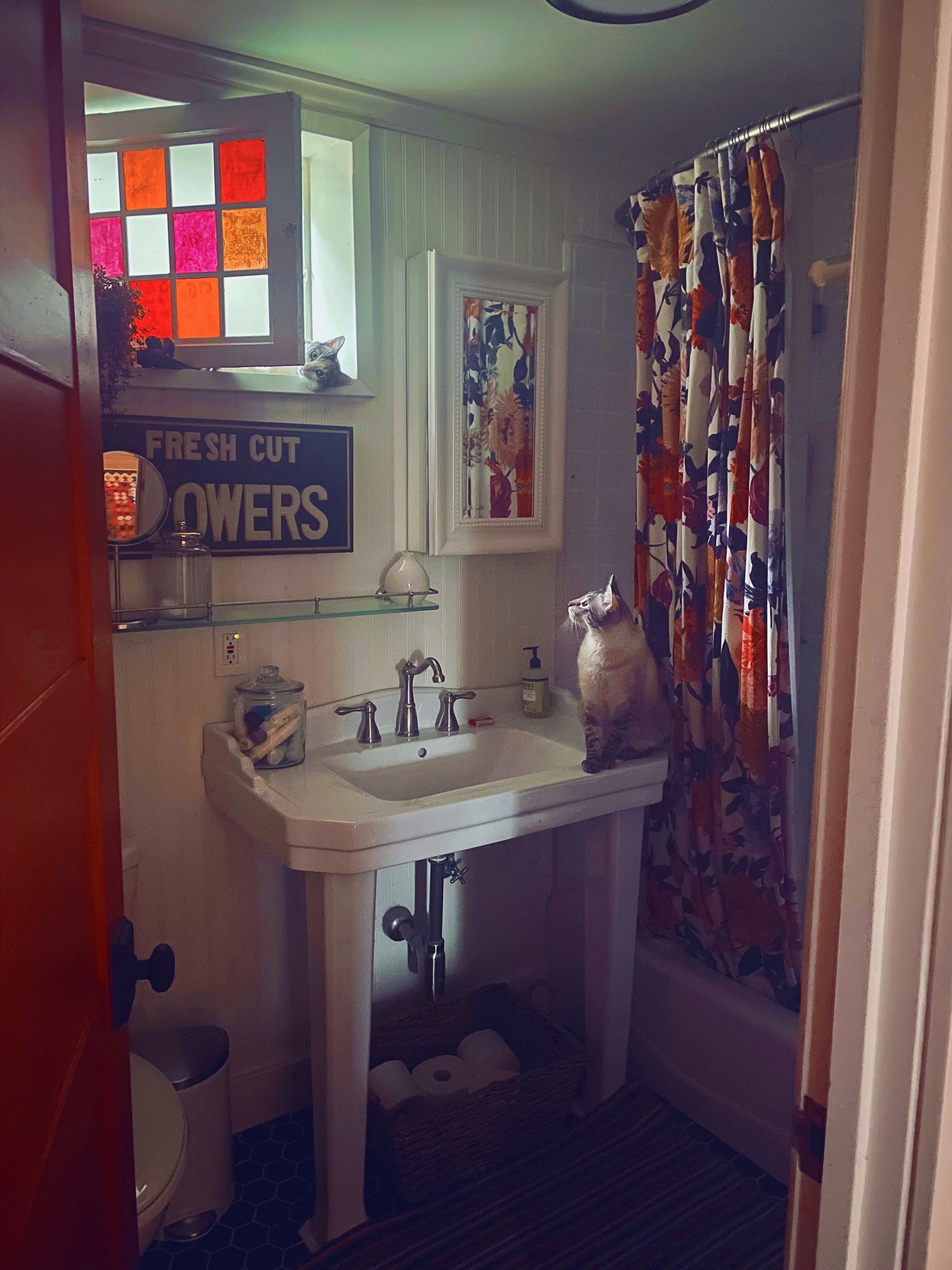
The location of the window made mirror placement a bit awkward, so we decided to go with a mirrored medicine cabinet on either side of the window (the extra storage is helpful, too, since we went with this vintage style console sink).
After.
The stained glass window is not original to the house. In fact, it isn’t even stained glass. It’s an acrylic window that was likely put in during the downstairs 60’s era renovation, and we always intended to replace it with a stained glass window. For the time being, I did a faux stained glass treatment which is a combo of window gels and stained glass paint and it looks pretty gosh darned believable. And yes, the window well is deep enough to perfectly store judgey chickens.
After.
After. The cats are weirdly obsessed with this room.
All in all, these two rooms are now so much happier and functional for our guests (and our animals, hehe).
Sources:
Guest bedroom:
Floors: Pergo Portfolio with WetProtect in Rustic Amber Chestnut
Wallpaper: Rifle Paper Co. Primrose Peel and Stick Wallpaper in Rose & Navy
All paint by Behr:
Doors: Farmhouse Red
Trim: Swiss Coffee
Bedding:
Pillows:
Dash Stripe Throw Pillow Hearth & Hand with Magnolia for Target in Green
Terracotta embroidered quilt pattern pillows made by my grandmother
Faded Stripe Throw Pillow Hearth & Hand with Magnolia for Target in Faded Blue
Embroidered Dog throw pillows: I really wish I could remember where I got these pillows. I am the worst.
Sheets: Opalhouse Designed with Jungalow Printed Cotton Percale Sheets in Floral
Gingham quilt: vintage made by my other grandmother
Art:
Original oil paintings of hunting dogs (all paintings hung on the walls) by my grandfather
Nightstand: built by the same painter grandfather
Small bench: Smith & Hawken from Target (no longer available)
Roman shades: Potterybarn circa 13 years ago (no longer available), but here is a similar one from Wayfair.
Rug: World Market
Bedside lamp: Opalhouse by Target Rattan Diagnonal Weave Table Lamp
Guest bathroom:
All paint by Behr:
Door: Farmhouse Red
Walls/Trim: Swiss Coffee
Shower curtain: Agneta Shower Curtain in Multi from Anthropologie
Rug: color no longer available but I highly recommend the indoor/outdoor rugs from AnnieSelke.com
Towels: Multicolor Sculpted Dot Finlay Towels from World Market
Console Sink: style no longer available but check out similar sinks at SignatureHardware.com
Floor tile: honed black marble hex tile from HomeDepot.com
That’s about all I can think of—if I’ve missed something that you’d like to know the source for, drop me a comment below!


